Web development
Lighthouse 100 does not prove a site is accessible
Accessibility · Lighthouse · RGAA
A Lighthouse 100 score is reassuring. It does not prove RGAA conformance, nor that a user can complete a real journey.
- Signal Lighthouse detects issues that can be automated.
- Blind spot Keyboard use, focus, modals and forms need human testing.
- Proof A credible audit combines tooling, manual journeys and a dated scope.
References checked on June 23, 2026. Lighthouse opens the investigation; it does not close it.
The myth
The shortcut "Lighthouse 100 = accessible site" is comfortable, but false.
Lighthouse has one major strength: it makes part of accessibility visible inside a tool that teams already know. In a few seconds, it can flag missing labels, accessible names, language issues, invalid ARIA attributes, simple contrast failures or structural problems. For a quick technical check, that is valuable.
The problem starts when the score becomes the conclusion. A 100 accessibility score does not mean a site conforms to RGAA. It does not mean every action works with a keyboard. It does not mean a screen reader understands the journey. It does not mean a form can be corrected, a modal can be closed, or a JavaScript component behaves as users expect.
The right reading is simpler: Lighthouse is a thermometer for certain symptoms. A thermometer does not make the full diagnosis, but it can tell you where to look more closely.
An automated score can open an investigation. It cannot close it.
What the score measures
Lighthouse is not the problem: it is a legitimate first step.
The Lighthouse accessibility score is built from automated audits. Chrome documentation describes it as a weighted average of accessibility audits, with each audit evaluated as pass or fail. In other words, Lighthouse does not inspect the whole experience. It evaluates detectable rules in the rendered page state it tests.
That approach is useful when it stays in its lane. It quickly catches issues that should not survive a review: informative images without alternatives, fields without labels, buttons without accessible names, invalid ARIA, duplicate identifiers, missing page language or heading structure problems.
| Detected signal | What it improves | What it does not guarantee | Extra check |
|---|---|---|---|
| Button with an accessible name | The button can be announced by assistive technology. | The label can still be ambiguous in the real context. | Read the journey with a screen reader and verify the intent. |
| Field with a label | The field is technically associated with text. | The error message may be missing, distant or not announced. | Submit the empty form, correct the error and finish the action. |
| Sufficient contrast | Some text/background pairs pass the checked threshold. | Hover, focus, disabled states, image overlays or dynamic content may escape the test. | Test real states and key components. |
| Valid ARIA | The ARIA syntax has no obvious error. | A component can be syntactically valid and still fail as an interaction. | Check role, state, keyboard behavior and spoken output. |
Blind spots
What an automated score cannot guarantee.
W3C says it plainly: evaluation tools help identify accessibility issues, but they cannot automatically check every aspect of accessibility. Human judgement is required. This is exactly where the real quality of a professional website is tested.
A tool can detect that a button has a name. It cannot always decide whether that name helps someone choose. It can detect that a field has a label. It cannot always know whether an error will be understood, announced, corrected and tied to the right field. It can detect that an element receives focus. It cannot always know whether the focus order follows the expected journey.
Keyboard
Links, buttons, fields, menus, tabs, accordions, modals and form steps must be reachable without a mouse.
Focus
Focus must be visible, logical, predictable, not trapped, and restored correctly after a component opens or closes.
Understanding
Headings, links, buttons, error messages and instructions must remain understandable outside the visual context.
Journey
Accessibility is verified through a complete action: search, filter, open, fill in, correct, submit and return.
30-second test
Put the mouse aside: the simplest test often reveals more than a score.
Before discussing RGAA in detail, run a short test. Open an important page, put the mouse aside, then try to reach and use key elements with the keyboard only. This does not prove conformance, but it quickly reveals major blocking issues.
Press Tab and follow the focus.
Every interactive element should be reachable in a logical order. If you lose sight of where you are, the journey is already fragile.
Open a menu, modal or dynamic component.
The keyboard must let you open, move through, activate and close the component without getting stuck.
Submit a form with an intentional error.
The message should be clear, close to the affected field, announced correctly and fixable without starting over.
Use Shift + Tab and Esc.
A good keyboard journey also lets the user go back, close a layer and recover focus in the right place.
Concrete example
A site can display 100 and still block a real action.
The common case is not a page that is visibly broken. It is quieter: a clean landing page, decent structure, labels in place, acceptable colors, then one component blocks the journey at the exact moment that matters.
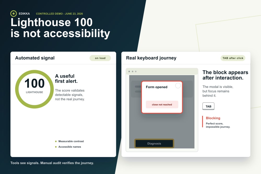
The visual demonstration for this article shows a deliberately simple case: a page can receive a perfect automated score on load, then block the user after a modal opens. Visually, everything appears to work. With the keyboard, focus remains behind the modal, the close button is not reached, or the user cannot return to the button that opened the window. The score is perfect, but the business action is inaccessible.
Two proofs, read together
The score and the journey do not answer the same question.
- Automated signal
The page scores 100 in Lighthouse accessibility: no critical automated issue appears in the tested state.
- Real interaction
A modal, custom select, mobile menu or form step becomes impossible to finish with a keyboard.
- Conclusion
The score was not wrong. It was incomplete. The decision "site accessible" came too early.
That is why a serious report must document the tested state, pages, components, tools and limits.
A div turned into a button or menu can look interactive with a mouse, yet fail to enter the natural tab order. Chrome reminds teams that custom controls require manual keyboard checks.
<div class="button-like" onclick="openModal()">
    Request a diagnosis
</div>
RGAA
An RGAA audit is not an automated score.
RGAA 4.1.2 organizes criteria and tests into 13 themes: images, frames, colors, multimedia, tables, links, scripts, mandatory elements, structure, presentation, forms, navigation and consultation. That scope goes far beyond what a single score can summarize.
The official accessibility statement requires a conformance status, test results, non-accessible content, test environment, tools used, audited pages, a contact path and remedy routes. This formality exists for a reason: accessibility is not a global impression. It is a situated verification.
Saying "we have Lighthouse 100" is useful. Saying "we tested these pages, these components, with these tools, on this date, and here are the limits" is much stronger.
Manual audit
What a manual audit actually verifies.
A manual audit is not Lighthouse repeated by hand. It looks at what the tool cannot conclude: real use, meaning, interaction consistency and the ability for a user to finish a task.
| Area | Audit question | Risk if not tested | Expected proof |
|---|---|---|---|
| Keyboard navigation | Can each component be reached, activated, closed and exited? | A user gets stuck or cannot convert. | Keyboard test log by template. |
| Visible focus | Is focus visible in all states and on all backgrounds? | The user navigates blindly. | Screenshots of critical states. |
| Forms | Are errors understandable, announced and correctable? | Contact, purchase or quote requests fail. | Documented error scenario. |
| Screen reader | Are structure, buttons, statuses and changes announced correctly? | The journey exists visually but not vocally. | Assistive technology check. |
| Content | Do headings, links, alt text and instructions make sense? | The code passes, but understanding fails. | Accessibility editorial review. |
Edikka method
Automate, test, date, document: the Edikka method.
At Edikka, an automated score is treated as input data, not final proof. Proof is built in layers: tools, human journeys, criteria, reservations, then a careful publication of scope and limits. This avoids two weak moves: selling a badge too quickly, or making accessibility impossible for decision-makers to understand.
On edikka.com, the public approach intentionally separates the accessibility statement, the audit report and the observatory. The statement gives the chosen status. The report lists checks, pages, tools and reservations. The observatory explains how to read public signals without confusing score, audit and conformance.
Tools
Lighthouse, WAVE, W3C checks, HTML validation and browser inspection quickly reveal detectable issues.
Journeys
Priority pages are tested as real paths: navigate, read, open, fill in, correct and submit.
Grid
Applicable criteria are tied to templates, evidence and reservations without turning a targeted check into abusive conformance claims.
Proof
The result must be dated, readable and testable again: that is the difference between a promise and proof.
Conclusion
The right goal is not "getting 100". It is not blocking use.
Keeping Lighthouse in the toolbox is a good decision. Turning it into an accessibility certificate is not. Between the two, there is a method: automatically check what can be checked, then manually verify the journeys, components and content that make the real experience.
A professional website does not prove quality with one isolated badge. It proves it with usable pages, documented decisions, prioritized fixes and dated evidence. That is more demanding. It is also much more credible.
Aim for Lighthouse 100, but do not stop there. The real test begins when someone uses the site without a mouse, without obvious visual context and without room for error.
Accessibility is proof of web quality, not a dashboard score.
A truly professional website must remain usable when conditions are less comfortable: without a mouse, with a screen reader, with a form error, on mobile, under fatigue, urgency or a temporary constraint.
Edikka connects accessibility, UX, development, SEO, AI visibility and conversion. The same effort that makes a journey more robust for a disabled person often makes the page clearer for Google, AI assistants, internal teams and customers.
Understand without guessing
Headings, links, buttons and errors must remain explicit without relying only on visual context.
Act without a mouse
A key journey should be reachable, correctable and finishable with the keyboard.
Document without overclaiming
A credible method publishes scope, date, tools, human tests and limits.
Go further on this topic
Additional answers to clarify the key points covered in this article.