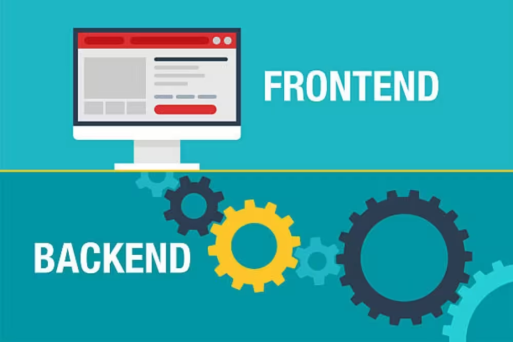
Web development
Web images: formats, compression, lazy loading and visual quality
Definition
A high-performing web image is light, sharp, responsive and stable.
Images play a major role in how a website is perceived. They enhance a brand, make an offer more tangible, support editorial content, strengthen trust and directly contribute to the visual quality of the user experience.
But images are also among the heaviest resources on a page. A poorly prepared image can slow loading, weaken LCP, create layout shifts, damage the mobile experience and make a website feel less professional.
Modern image optimisation is therefore about finding the right balance: choosing the right format, serving the right dimensions, applying controlled compression, deferring non-critical images and preserving the visual finesse required for a premium result.
An optimised image should never look compressed. It should feel natural, load fast and blend perfectly into the experience.
Approach
Optimise without weakening the premium perception.
At Edikka, image optimisation is not treated as a simple file weight reduction task. It is part of art direction, front-end performance, SEO, accessibility and the perceived quality of the website.
An image must be light, but it must also respect the level of refinement expected by the project: sharpness, contrast, framing, colours, details, texture, depth and consistency with the visual identity. Performance should not crush quality. It should support it intelligently.
Format
02Weight
03Quality
04Loading
Challenge
Why images influence speed, SEO and conversion.
Images have a direct impact on loading speed, especially on mobile. An image that is too heavy, too large or poorly prioritised can delay the display of the main content and create a slower experience than necessary.
They also influence trust. A blurred, pixelated, poorly cropped or over-compressed image can weaken brand perception. By contrast, an image that is sharp, stable and fast reinforces the feeling of quality.
Speed
Adapted images reduce page weight and accelerate the display of important content.
Stability
Properly defined dimensions prevent unexpected layout shifts during loading.
Perception
Controlled visual quality strengthens credibility, premium positioning and trust.
Conversion
Fast and convincing visuals make understanding, desire and action easier.
Method
The 10 pillars of professional image optimisation.
An effective image strategy does not rely on a single technique. It combines format selection, compression, responsive dimensions, loading priority, lazy loading, visual stability, image SEO, accessibility and quality control.
The goal is to serve every user the most suitable image for their device, connection, screen and browsing context, without damaging the visual result.
Formats
Choose the right format for each image type
Format selection is the first decision. A photograph, illustration, logo, icon, screenshot or transparent image should not necessarily use the same format.
Highly effective for reducing the weight of photos and rich visuals with modern compression.
An excellent balance for photos, illustrations and common web images.
Still useful as a compatibility format or for some photos when the workflow requires it.
Ideal for logos, pictograms, icons, simple diagrams and vector visuals.
Visual quality
Compress without creating a low-end effect
Excessive compression can create artefacts, smooth textures, damage gradients, dirty details or make visuals feel less premium. Optimisation must therefore be progressive and visually controlled.
The right compression level is the one that strongly reduces file weight without making compression visible to the eye in the real display context.
- Test several quality levels before validating a global setting
- Compare images on mobile, desktop and high-density screens
- Monitor sensitive areas: faces, materials, shadows, jewellery, textures and gradients
- Avoid repeated compression from a file that is already degraded
- Keep a high-quality master outside production for future variants
Dimensions
Serve the right size to the right screen
A common mistake is to display an image in a small visual space while loading a file that is far too large. The browser then has to download an oversized resource, which slows the page without improving the final result.
Responsive images allow several versions of the same visual to be served depending on screen width, pixel density and the actual space occupied by the image in the layout.
- Create several image widths for the main layouts
- Use
srcsetto offer different sizes - Define
sizesto help the browser choose the right resource - Provide sufficient quality for high-density screens
- Avoid serving a heavy desktop image to a mobile user
Art direction
Adapt the framing instead of simply shrinking the image
A responsive image should not always be a smaller version of the same visual. On mobile, a wide crop can lose the main subject. A premium image must remain readable, balanced and expressive at every size.
Prepare different versions when the main subject may become too small or poorly placed on mobile.
Define the important visual subject to avoid awkward automatic cropping.
Maintain balance between text, image, negative space and breathing room.
LCP
Prioritise the main image instead of lazy loading it
The main image visible at load can become the LCP element of the page. If it loads too late, is too heavy or has insufficient priority, the page will feel slow even if the rest of the website is well optimised.
A hero image or LCP image should generally not be lazy loaded. It should be available quickly and prioritised correctly.
- Do not use
loading="lazy"on the main image visible above the fold - Use
fetchpriority="high"when the image is genuinely critical - Preload the LCP image in some complex cases
- Avoid hero images that depend on late scripts or heavy carousels
- Test LCP on mobile with real data and laboratory tools
Lazy loading
Lazy load off-screen images
Lazy loading delays the loading of images that are not immediately visible. It reduces the initial page weight and leaves more resources available for the important elements of the first screen.
Images lower on the page, secondary galleries and non-critical editorial visuals.
Hero images, LCP visuals, essential logos or elements visible immediately at load.
Use loading="lazy" for non-priority images.
Test the real rendering to avoid late appearances or empty-page effects.
Stability
Avoid layout shifts with explicit dimensions
An image that loads without reserved dimensions can push content down and create an unexpected shift. This damages the experience, especially when the user is trying to read or click while the page is loading.
- Set
widthandheightattributes on images - Keep a consistent ratio with
aspect-ratiowhen necessary - Reserve space for dynamic visuals, galleries, carousels and embeds
- Avoid injecting images late above already visible content
- Control CLS on the most important templates
CDN
Automate variants with an image CDN or server-side pipeline
The more images a website contains, the more fragile manual optimisation becomes. An image CDN or server-side pipeline can automatically generate the right formats, sizes and quality levels depending on real usage.
Automatically generate AVIF, WebP or JPEG versions depending on the context.
Create several widths adapted to layouts and devices.
Adjust compression levels by image type and visual quality requirement.
Serve images quickly from locations close to the user.
SEO & accessibility
Optimise images for understanding and accessibility
A web image is not just a visual file. It contributes to how a page is understood. Its file name, context, alternative text and integration into content can help users, search engines and assistive technologies.
- Write useful alternative text when the image provides information
- Use an empty
alt=""for purely decorative images - Name files descriptively, without over-optimisation
- Place images in a coherent editorial context
- Use captions when the visual provides specific information
- Prepare high-quality social sharing images for important content
Quality control
Set up visual and technical validation
A premium image strategy must be controlled. Weight, rendering, framing, sharpness, stability, accessibility and visual consistency should all be checked before publication.
Formats
Which format should you choose for each visual type?
The best format depends on the visual, the expected quality level, transparency needs, compatibility, final weight and rendering on the target screens.
A format should not be chosen only because it is modern. It should be chosen because it provides the best balance between perceived quality, weight, technical support and real use.
AVIF, WebP, JPEG, PNG, SVG.
Test first for photos and rich visuals when the rendering remains clean.
A very strong general format for reducing weight with broad compatibility.
Useful for some photos, existing workflows or fallback needs depending on the context.
Best for logos, icons, pictograms and vector graphic elements.
Early signals
Signs that your images are slowing down or weakening your website.
An image problem is not always visible at first glance. It can appear in performance scores, mobile behaviour, layout shifts or a perceived quality level below what the brand requires.
Important pages load slowly because images are too heavy.
Images look sharp on desktop, but too small or poorly cropped on mobile.
Visuals look dull, blurred, pixelated or damaged by compression.
Content shifts while images are loading.
The hero image arrives late even though it is essential to the first screen.
The same image file is used everywhere, regardless of the actual display size.
Prioritisation
Optimise first the images that have the greatest impact.
Not every image deserves the same level of effort. Priority optimisations should focus on visuals that have the greatest influence on speed, conversion or perceived quality.
Hero images, product visuals, service pages, premium galleries, landing pages and high-traffic pages should be handled with greater care than secondary images.
LCP image
Optimise the main image visible at load: weight, format, priority, dimensions and rendering.
Business pages
Prioritise pages that generate enquiries, sales, contacts or appointments.
Premium visuals
Preserve the quality of images that carry the brand, product or credibility.
Repeated templates
Optimise images used in lists, cards, sliders, categories and recurring components.
Workflow
The ideal workflow for managing images on a professional website.
Image optimisation should be integrated into the publishing process. If every image is processed manually, quality becomes inconsistent. If everything is automated without control, premium rendering can deteriorate.
The right workflow combines a high-quality source, generation rules, technical control, visual validation and post-publication monitoring.
Keep a clean, non-degraded source image, large enough and properly framed.
Generate several sizes, formats and quality levels according to real website uses.
Check weight, rendering, ratio, alternative text, stability and visual consistency.
Measure performance, correct heavy visuals and prevent regressions.
Premium quality
How to preserve a high-end look after optimisation.
A premium website cannot rely only on lightweight images. Visuals must remain elegant, precise and consistent with brand positioning. Compression should be invisible, framing controlled and sharpness adapted to the display context.
Perceived quality often depends on details: contrast, black depth, material rendering, edge finesse, detail readability, absence of artefacts and consistency between visuals on the same page.
Sharpness, colour, texture, consistency.
The image remains precise in important areas, without pixelation or excessive blur.
Colours remain faithful, natural and consistent with the visual universe of the website.
Textures, details, shadows and gradients are not crushed by compression.
Images on the same page maintain a homogeneous level of quality and treatment.
Common mistakes
The mistakes that damage performance or brand perception.
Optimisation mistakes often come from an oversimplified approach: compressing every image the same way, using a single format everywhere, forgetting mobile or lazy loading visuals that should be prioritised.
The right strategy requires more nuance. A gallery image, thumbnail, product photo, hero banner or SVG icon does not have the same requirements.
Reducing weight at the expense of detail, texture and premium perception.
Serving the same heavy file to every device instead of using responsive variants.
Deferring a critical image visible at load and damaging LCP.
Forgetting useful alternative text or filling alt attributes with artificial keywords.
What works
The principles of a fast and high-end image strategy.
The best optimised websites do not sacrifice quality. They serve the right images, in the right formats, at the right dimensions, with the right priority and visual control adapted to the expected level of refinement.
Performance comes from a coherent system: clean source files, automated generation, modern formats, responsive sizes, targeted lazy loading, prioritised LCP image, reserved dimensions and continuous monitoring.
Format, size, priority, quality.
Choose AVIF, WebP, JPEG, PNG or SVG depending on the visual type and expected rendering.
Serve an image adapted to the real display space and to the user device.
Load critical images quickly and defer secondary images.
Control the visual result to preserve sharpness, colours and premium perception.
Conclusion
Optimising images means protecting both speed and perceived quality.
Web images sit at the crossroads of performance, design, SEO, accessibility and conversion. They must be light enough not to slow the website, but refined enough to preserve brand image.
Professional optimisation relies on a complete method: choosing the right formats, generating responsive sizes, compressing with precision, prioritising critical images, lazy loading secondary images, reserving dimensions and checking the final rendering.
The real objective is not to obtain the smallest possible files. It is to find the best balance between weight, speed, sharpness, stability and premium perception. This control is what makes it possible to build a fast website without sacrificing visual quality.
An optimised web image should not only be lightweight. It should be relevant, stable, accessible, fast and visually impeccable in its display context.
A web image should never have to choose between beauty and performance.
Images are often responsible for a large share of page weight. Yet compressing them aggressively or visually degrading them is not an acceptable solution for a premium website.
At Edikka, we approach image optimisation as a precise balance between perceived quality, loading speed, organic visibility and user experience. The right format, the right compression, the right loading strategy and the right dimensions make it possible to create a fast website without sacrificing the visual standards of the brand.
Choose the right format according to the real use of the image
A decorative image, product photo, editorial illustration or hero visual should not all be handled in the same way. WebP, AVIF, SVG, JPEG and PNG each have their role. The goal is not to use the most modern format everywhere, but the format best suited to expected quality, final weight and project compatibility.
Compress without breaking the premium perception
Successful compression should not be visible. It reduces file weight while preserving sharpness, contrast, important details and brand visual consistency. On a high-end website, optimisation should never create visible artefacts, dirty textures or dull visuals that weaken design credibility.
Load every image at the right moment, in the right size
Lazy loading, adapted dimensions, responsive images and loading priorities can significantly speed up a page. An image visible on arrival should be anticipated. An image lower on the page can be deferred. Performance comes from this hierarchy: load what matters first, then display the rest without slowing down the experience.
Optimising web images does not mean reducing their quality. It means preserving visual impact while removing unnecessary weight, poorly chosen formats and costly loading. A premium website must be beautiful, fast and technically controlled.
Go further on this topic
Additional answers to clarify the key points covered in this article.