Digital strategy
Conversion Funnel: A Simple and Effective Guide
Definition
A conversion funnel turns intent into action.
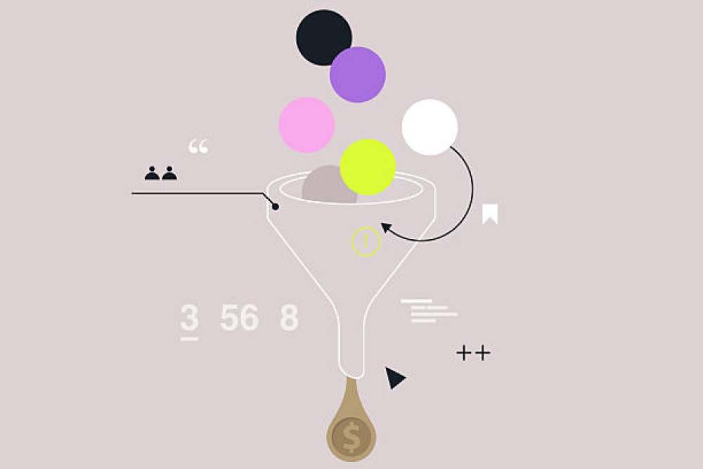
A conversion funnel refers to all the steps a user goes through before completing an important action on a website. This action may be a purchase, a contact request, a registration, a download or a quote request.
Its role is to guide the user progressively. Each step must answer a specific question: understanding the offer, assessing its relevance, building trust, removing doubts and making the final action easy to complete.
An effective funnel does not try to push users too quickly. It supports them with the right messages, the right proof points and the right calls to action at the right moment in the journey.
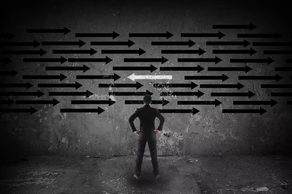
A strong conversion funnel does not force a decision. It removes the hesitation that prevents users from moving forward.
Approach
Building a logical, clear and reassuring journey.
At Edikka, a conversion funnel is designed as a progression. Users should not simply see an offer: they need to understand it, perceive its value, find the proof they need and know exactly what action to take next.
This approach connects UX, content, design, value proposition, trust signals and behavioural data. Every stage of the funnel should either reduce friction or strengthen motivation.
Attention
02Understanding
03Trust
04Action
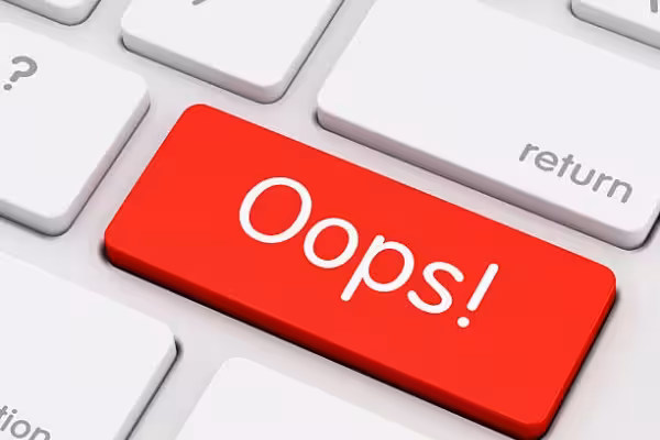
Challenge
Why a website can attract visitors without converting them.
Many websites generate traffic but produce few results. The problem does not always come from acquisition. It often comes from the journey itself: an unclear message, lack of proof, too many steps, a discouraging form or a poorly placed call to action.
A conversion funnel helps analyse these obstacles. It shows where users hesitate, disengage, abandon the journey or fail to understand the next step.
Attract
Bring the right visitors to a page that matches their intent.
Explain
Quickly clarify the offer, the benefit and the next possible step.
Reassure
Provide the proof needed to reduce doubt and strengthen trust.
Convert
Simplify the final action to turn interest into a concrete result.
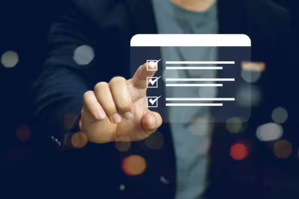
Method
The 7 stages of an effective conversion funnel.
A high-performing conversion funnel follows a simple progression: capture attention, clarify the need, present a solution, demonstrate value, build trust, reduce friction and trigger action.
This method helps create a journey that is clearer, more persuasive and more profitable, without adding unnecessary elements.
Attention
Attract the right visitors with the right promise
A funnel begins before the user even lands on the website. They may come from a search engine, an advertising campaign, a social network, an email or a recommendation. The promise that brings them in must be consistent with the page they discover.
- Message aligned with the traffic source
- Clear promise visible from the top of the page
- Well-identified user intent
- Landing page aligned with the objective
- No disconnect between acquisition and content
Understanding
Make the offer easy to understand quickly
Users should understand within a few seconds what is being offered, who it is for and why it can help them. A poorly explained offer creates hesitation, even when the product or service is relevant.
The faster users understand the value of the offer, the more likely they are to continue the journey.
- Simple and visible value proposition
- Main benefit immediately identifiable
- User-oriented copy rather than company-centred messaging
- Clear hierarchy between headline, content and action
- Early objections addressed in the key sections
Value
Show why the offer deserves attention
Once the offer is understood, users need to perceive its value. Listing features is not enough. The page must explain the benefits, the expected outcomes and what truly sets the solution apart.
Explain what the user gains in concrete terms.
Show why this solution is preferable to an alternative.
Present important information without overload.
Connect promises to verifiable elements.
Trust
Build confidence before asking for action
Conversion requires trust. Before clicking, buying or completing a form, users look for reassurance: reliability, expertise, reviews, results, references, security, transparency or clear conditions.
Reviews, testimonials, work examples, references, key figures or client cases placed at decisive moments.
Clear information about prices, timelines, steps, conditions, guarantees or terms.
Professional design, precise content, demonstrated expertise and consistent branding.
Friction
Remove the obstacles that slow action down
Every obstacle can reduce conversion: an overly long form, slow loading time, confusing navigation, missing information, unnecessary steps or too many choices.
Action
Create clear and context-aware calls to action
Users should always know what the next step is. A good call to action is visible, explicit, consistent with the context and adapted to the visitor’s level of maturity.
- Main CTA visible in decisive areas
- Precise wording: request a quote, book a call, create an account
- Secondary action for less advanced visitors
- Placement aligned with benefits or proof points
- Simple, readable and reassuring form
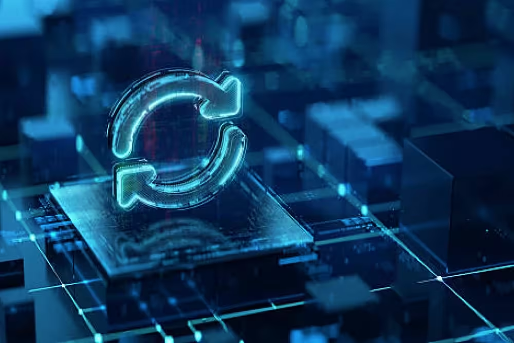
Optimisation
Measure drop-offs and improve continuously
A conversion funnel should never remain static. It must be analysed through data: click-through rate, form abandonment, scroll depth, mobile behaviour, exit pages and the quality of the conversions generated.
Traffic sources, visitor quality and consistency with the landing page.
Clicks, scroll, interactions, time spent and views of key sections.
Stages where users leave the journey or interrupt the action.
Requests, sales, registrations, appointments and quality of the leads generated.
Prioritisation
Optimising the funnel where losses are most costly.
Not every stage of the funnel carries the same weight. A small friction point close to conversion can have more impact than a minor detail located much earlier in the journey.
The right approach is to identify where users abandon the journey, then understand why: lack of trust, overly long form, unclear promise, poorly explained pricing, technical slowness or an unconvincing call to action.
Impact, friction, trust, effort.
Does the stage directly influence a sale, contact request or qualified enquiry?
Does the issue add unnecessary effort, confusion or hesitation to the journey?
Does the user have the proof they need before taking action?
Is the fix easy to implement, or does it require a deeper redesign?
Early signals
Signs that a conversion funnel needs to be improved.
A weak funnel is not always immediately obvious. It may generate traffic, clicks or page views, while producing too few concrete actions compared with the website’s real potential.
Landing pages generate traffic but few clicks on calls to action.
Users view the offer but do not reach the form or basket.
The form is started but rarely completed and submitted.
Visitors often ask the same questions before making a decision.
The mobile journey shows more drop-offs than the desktop journey.
Conversions exist, but their commercial quality remains too low.
Deliverables
What conversion funnel optimisation should produce.
Optimising a conversion funnel is not about changing a few visual elements. It requires a clear reading of the journey, the obstacles, the motivations and the actions that should be corrected first.
The result must be directly actionable: stronger landing pages, clearer messages, better-placed proof points, more effective CTAs, simplified forms and more precise conversion tracking.
Journey mapping
A clear view of the steps users follow before conversion.
Friction diagnosis
Identification of confusion, drop-off, doubt or friction points.
Message optimisation
Clarification of the offer, benefits, proof points and calls to action.
Testing plan
A list of hypotheses to test according to potential impact and ease of implementation.
What works
The principles of a simple and effective conversion funnel.
The funnels that convert best are not necessarily the most complex. They are clear, coherent, reassuring and adapted to the user’s level of readiness.
Their strength comes from the alignment between the entry promise, page content, proof points, design, calls to action and the simplicity of the final step.
Clarity, trust, fluidity, measurement.
Users quickly understand the offer, the benefit and the expected action.
Proof, guarantees and reassurance elements appear at the right moment.
The journey removes unnecessary steps and reduces the effort required to convert.
Data helps identify drop-offs, test hypotheses and improve the funnel over time.
Conclusion
An effective conversion funnel makes the decision easier.
A well-structured conversion funnel guides users from their initial intent to the final action. It clarifies the offer, demonstrates value, builds trust and reduces the obstacles that can lead to abandonment.
Its performance depends on the consistency between every stage: traffic source, landing page, message, proof, call to action, form or checkout journey. If one of these elements creates a break, conversion becomes harder.
Optimising a conversion funnel means making better use of existing traffic. The website no longer simply attracts visitors: it guides them, reassures them and turns them into concrete results.
A strong conversion funnel does not make the journey more complex. It makes every step clearer, smoother and more reassuring until the final action.
A good conversion funnel does not push the user. It guides them.
Converting is not about multiplying buttons or forcing a decision. An effective funnel builds a logical progression: it attracts attention, clarifies the offer, reassures the visitor and makes action feel natural.
At Edikka, we believe a high-performing digital journey relies on a precise balance between strategy, readability, user experience and trust. Every step must have a clear role, without overload or unnecessary friction.
Orient
The visitor must quickly understand where they are, what you offer and what action they can take without effort.
Reassure
Conversion depends as much on credibility as on design. Proof, arguments, fluidity and coherence reduce hesitation.
Simplify
The simpler, more visible and more logical the final action is, the more efficient the journey becomes. A good funnel removes friction instead of adding it.
Go further on this topic
Additional answers to clarify the key points covered in this article.